Visualization
Using Tableau, create visualization for each question in the report. You will work on this independently just like last week.
To include a Tableau visualization in your report, take a screenshot, save it as an image,
put it in the learning/week2 folder, and replace  with
your own image. Please makes sure your screenshot includes the entire Tableau interface
including the controls, widgets ...etc.
Import
Data: fcq.clean.json
(a copy of this file is in your book repository already in the directory hackathons/fcq)
This dataset is provided to you in the JSON format. Your first task is to figure out how to transform this JSON file into a format that can be fed into Tableau. As a junior and senior, you are expected to be able to look around the Internet to problem solve.
How many instructors have taught each subject? Kari
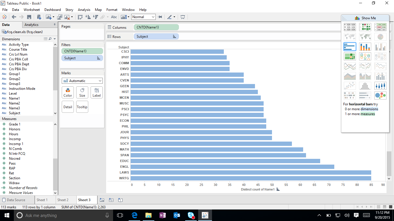
At the bottom you can see that WRTG and LAWS have the highest amount of instructors for each subject.
Does the instruction tends to give out higher grades if they teach more classes? or the reverse? Ming
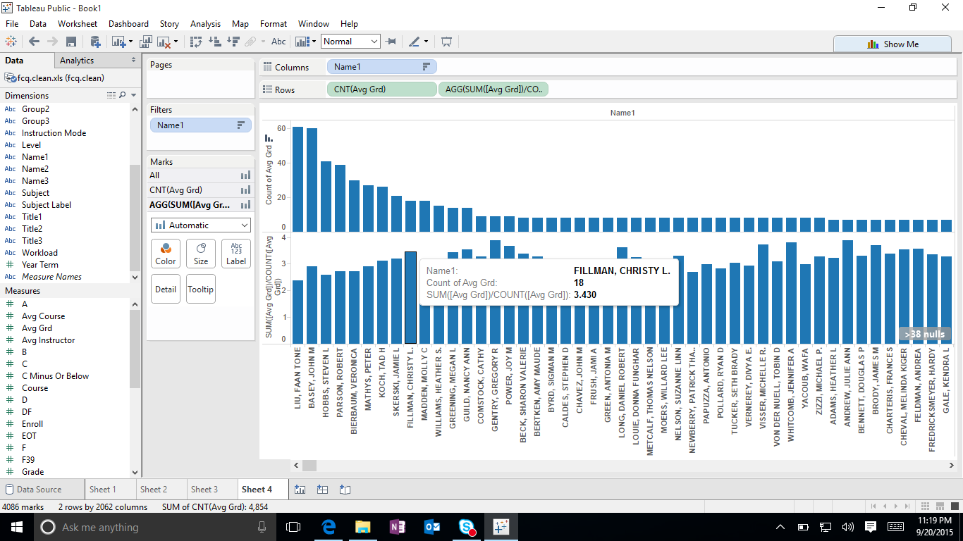
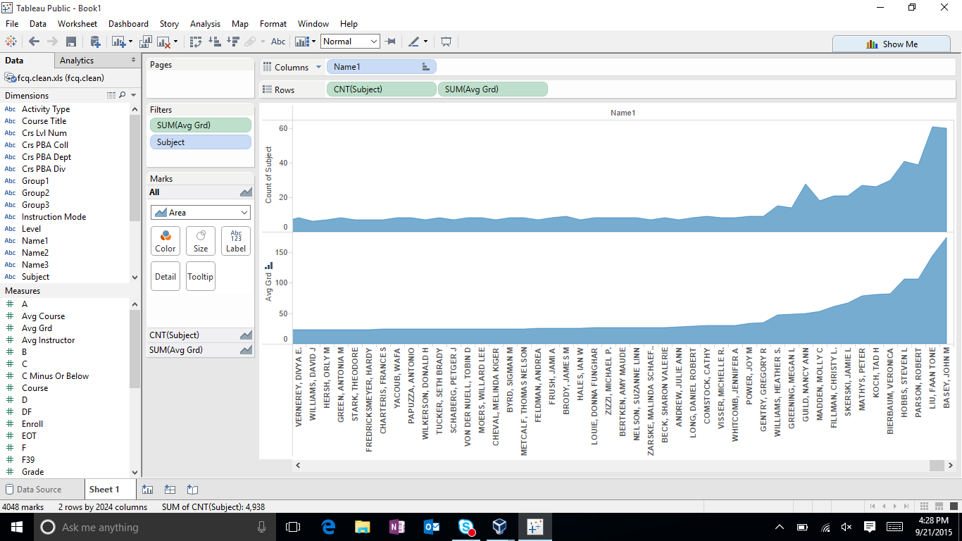
This was difficult to show so I just put an avg grade and the total of subjects which I think correlated to the instructors avg. grade.
Which department has the lowest enrollment? John
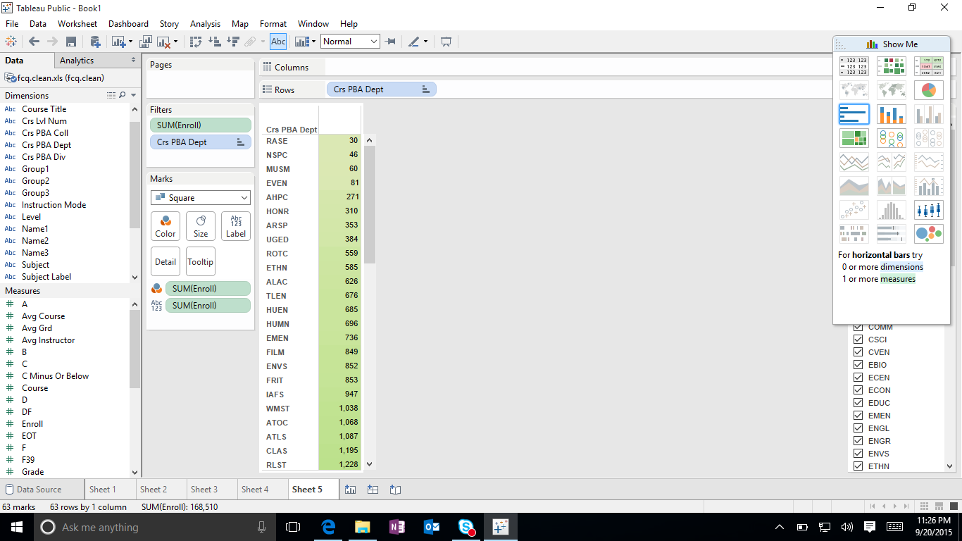
As you can clearly see RASE has the lowest enrollment. The chart is ordered from least to greatest.
Which subject is most in demand,based on the total number of enrollment? Sussant
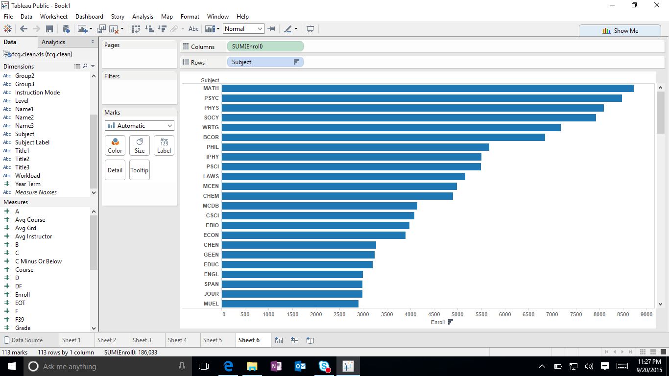
Math has the highest enrollment. The chart is ordered from greatest to least.
Which course has the highest enrollment? Andrew
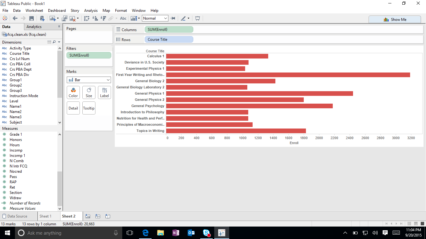
For this one you can see that First year writing has the highest enrollment.